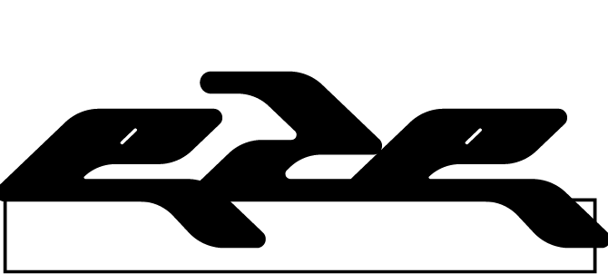
Zalera is my personal brand that will offer my customized apparel and accessories as well as my design services. "My ERA of Design". Below is the design system of Zalera. This brand portrays my inner personality of fun-ness and uniqueness that I want to share with my future costumers.
These are the sketches I have drawn before coming to a conclusion on Zalera’s Logo. I took some concepts within the thumbnails and tweaked it to fit the brand look and identity that I was going for.
BLACK & WHITE LOGO
I chose the Zalera logo because it reminds me of a butterfly soaring in the sky, chasing its dreams with elegance and balance. What really caught my attention is the asymmetrical symmetry of its wings, which makes it look mysterious and beautiful, just like butterflies. I think the logo represents the idea that we're all on a unique journey, and that's what makes it special. It's like we're all in our own era, creating our own stories. Plus, the logo is looks unique and modern because of its simple design. With the Zalera's logo, you can embody the elegance and ambition of the butterfly, and carve your own unique path towards your goals.
MAIN LOGO
This is the main logo of ZALERA. This emblem takes the form of a butterfly, symbolizing both growth and balance. The incorporation of the letter Z to represent the butterfly's wings introduces playful patterns, adding a touch of craziness and fun to the design. My deliberate design choices for Zalera are anchored in the principles of balance, where the interplay of vivid hues and the symbolic representation of a butterfly create a visual narrative that authentically mirrors the brand's commitment to individuality and vibrancy.
SUB LOGOS
These sub logos are design to adapt to different sizes, format and backgrounds. It is perfect for print as well. By creating variations the primary logo, it would increase the chances of making a lasting impression on my targeted audience.
BRAND COLORS
Embracing a y2k design aesthetic, I've strategically chosen vibrant colors like purple, yellow, and various shades of pink to infuse dynamism into the brand's logo. As a brand, Zalera is adaptable, always exploring new design techniques, colors, and materials, while staying true to its distinctive aesthetic. My goal is to positively impact the fashion industry and society by delivering standout products that reflect the latest industry trends.
TYPOGRAPHY
I selected these fonts based on their distinct characteristics and suitability for different elements for a website's design. Eckmannpsych stands out with its bold and eye-catching style, making it perfect for headlines (H1 and H2) and other prominent areas where emphasis and hierarchy are crucial.
Arimo offers versatility and readability, serving as the main font across the website for headings (H1-H6) and paragraphs. Its clean and balanced appearance ensures clear communication of content on various devices and screen sizes.
As for Neue Haas Grotesk, it adds an extra layer of visual interest and emphasis as a secondary font, especially in bold variations for selected headings and paragraphs. By carefully selecting these fonts, I aimed to create a harmonious typographic system that enhances the overall design aesthetics of the brand.
PATTERNS
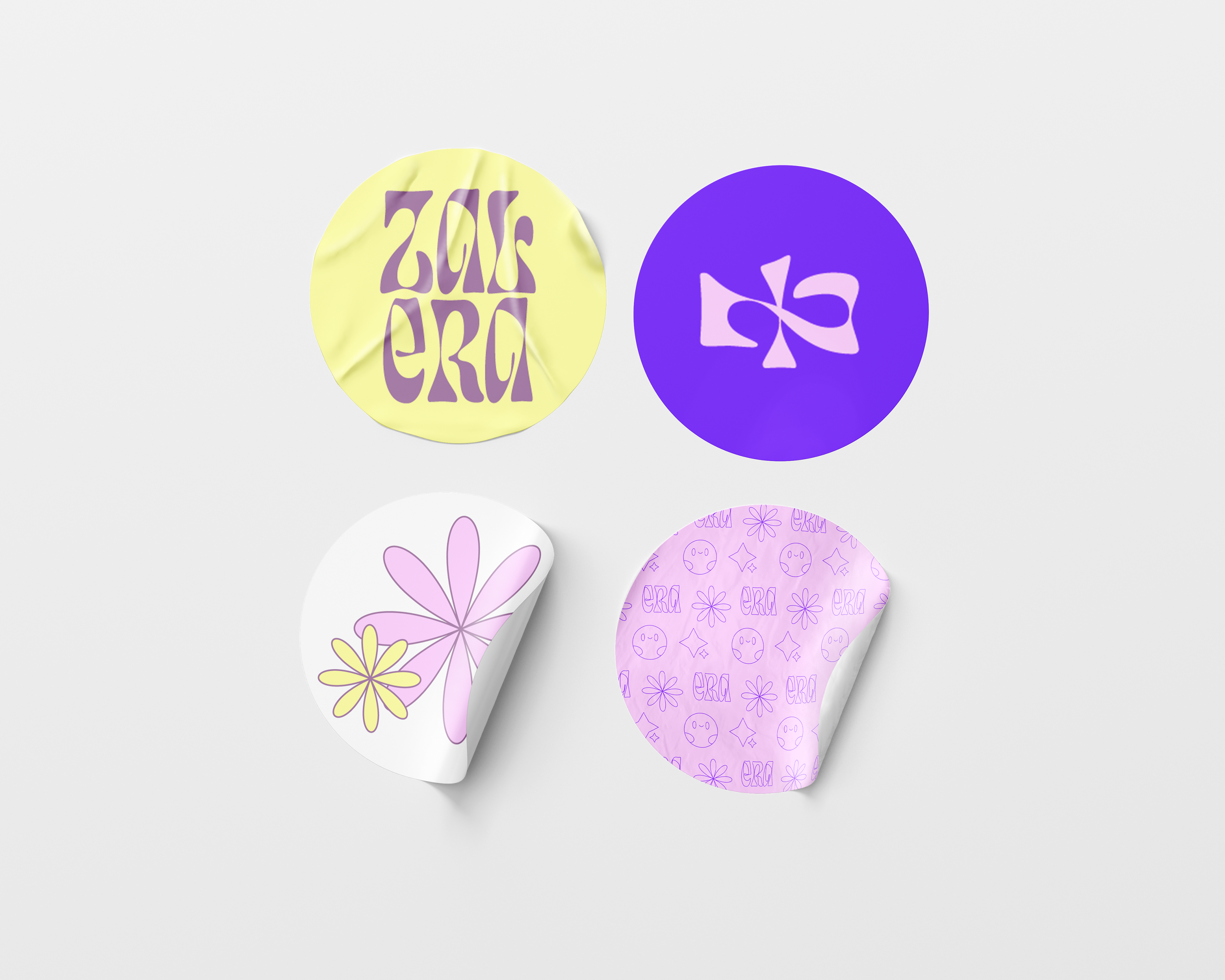
Additionally, I've crafted unique patterns to infuse character into both the brand and its clothing line. These patterns can be used for packaging materials, providing a visually captivating and cohesive branding experience across various products. Whether it's for boxes, stickers, or labels, incorporating these designs adds a touch of sophistication and unity to the overall packaging aesthetics. The use of these patterns not only enhances the visual appeal of the packaging but also reinforces brand identity and recognition. These distinctive patterns serve as a powerful tool to attract and engage consumers, leaving a lasting impression of quality and consistency."
MOCKUPS
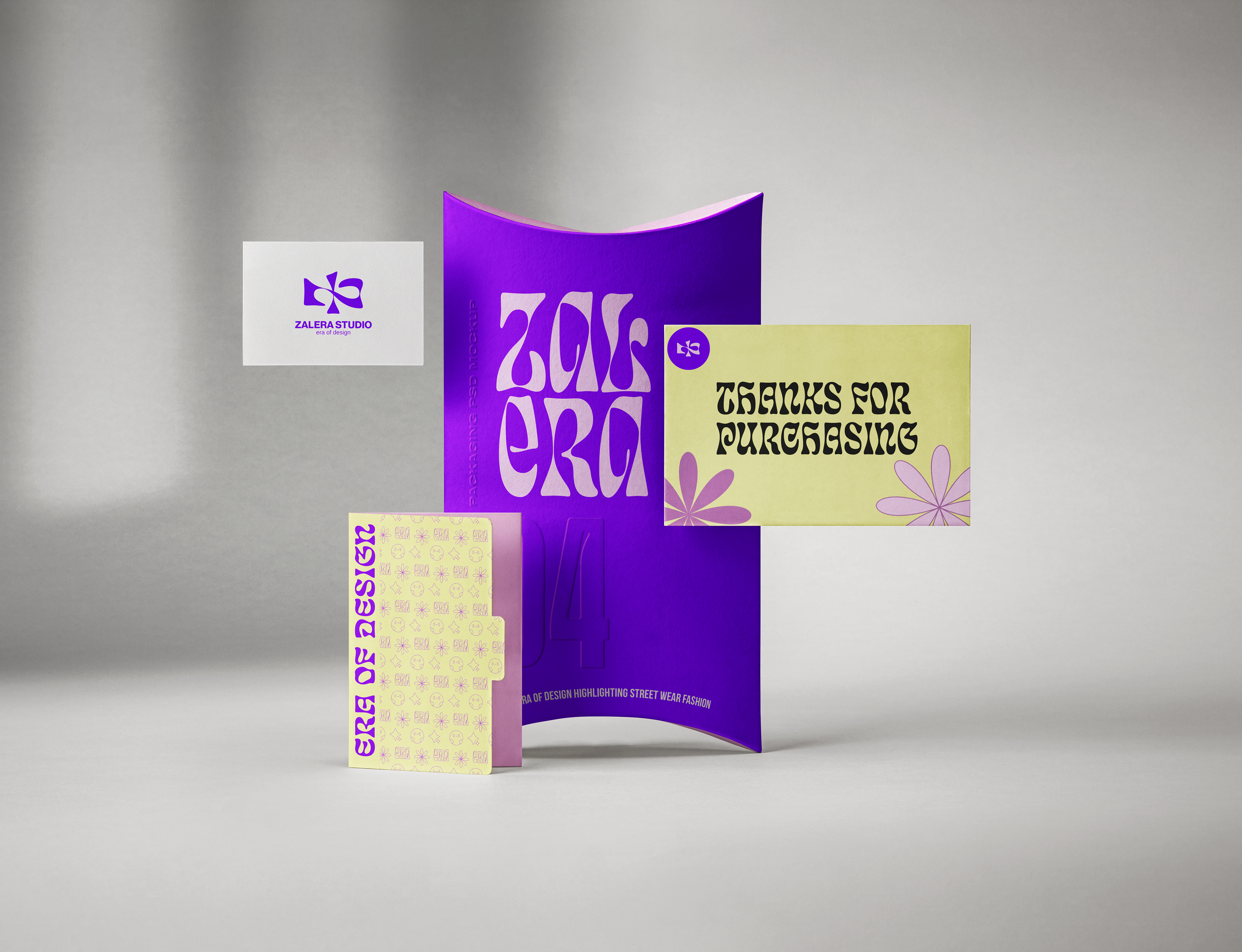
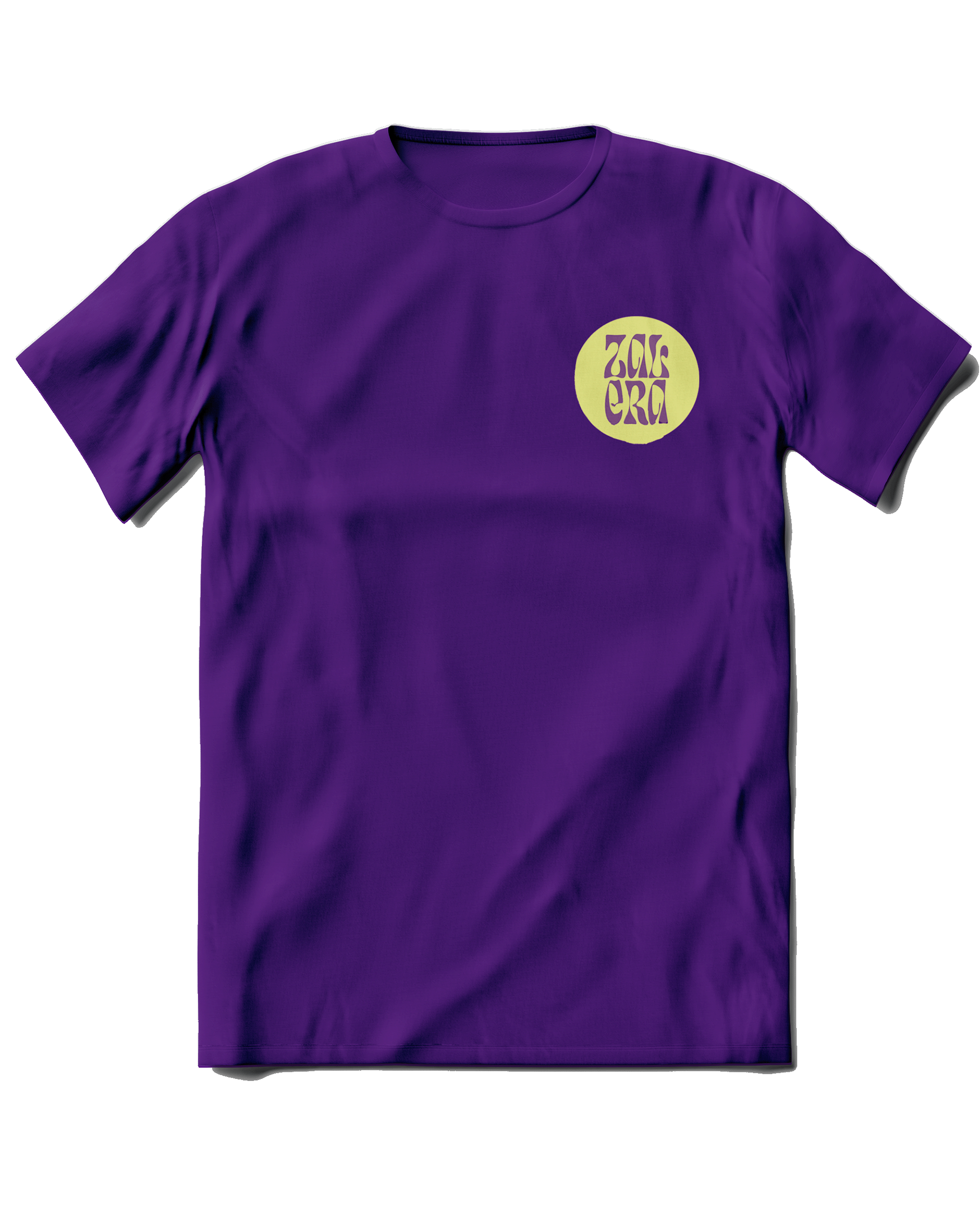
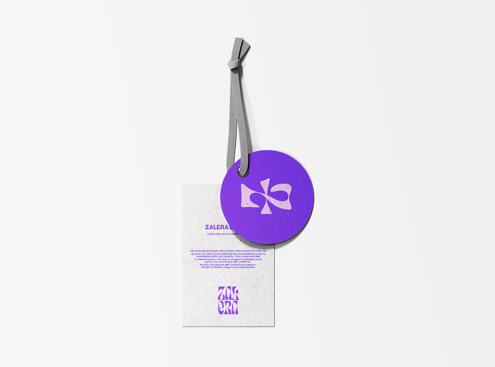
Here some mockups showcasing the brand's identity in action.
