VERVE is a shop specializing in handcrafted ceramics, the challenge is to capture the essence of modernity and tradition while maintaining a simple and minimalistic aesthetic. This project is a brand brief by @brand.brief on Instagram.
MAIN LOGO
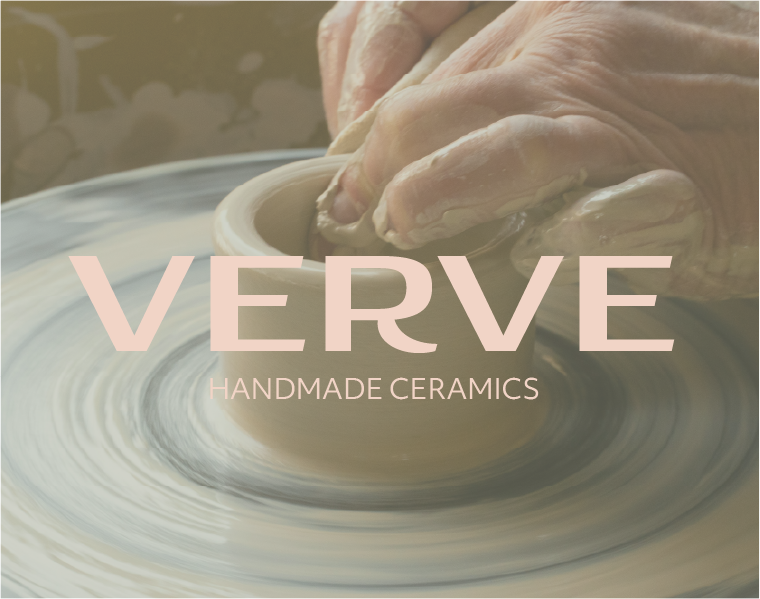
To tackle this challenge, I chose to blend current design trends with traditional trends, creating a wordmark logo that reflects Verve’s characteristics. By exploring various typography, color palettes, and imagery, I designed a logo that evokes the principle of “less is more” – a clean and simple wordmark.
SUBMARK LOGO
I delved into some research on the ceramics industry, studying both modern trends and traditional techniques to make my design decisions as well as getting inspiration from other modern graphic designers.
Crafting the sub mark logo proved to be another challenge in this project, since it required precision and creativity to capture VERVE's identity in a smaller, more simplified form.
The sub mark logo is designed to encapsulate the essence of VERVE's modern and minimalistic identity. By combining the root letter "V" from the brand name with a ceramic shelf shaped like the letter "E," the sub mark logo achieves a unique and distinctive visual representation that reflects the brand's identity.
BRAND COLORS
VERVE's brand color palette blends modern sophistication with artisanal warmth. Comprising four key colors, it reflects the fundamental essence of the brand's values.
The deep, rich oceano exudes timeless elegance, while the olive green, a tranquil earthy tone, evokes harmony reminiscent of natural ceramics. A blush adds a soft touch, imbuing warmth and approachability, while dirty moon, a crisp, clean shade, symbolizes purity and transparency in craftsmanship.
TYPOGRAPHY
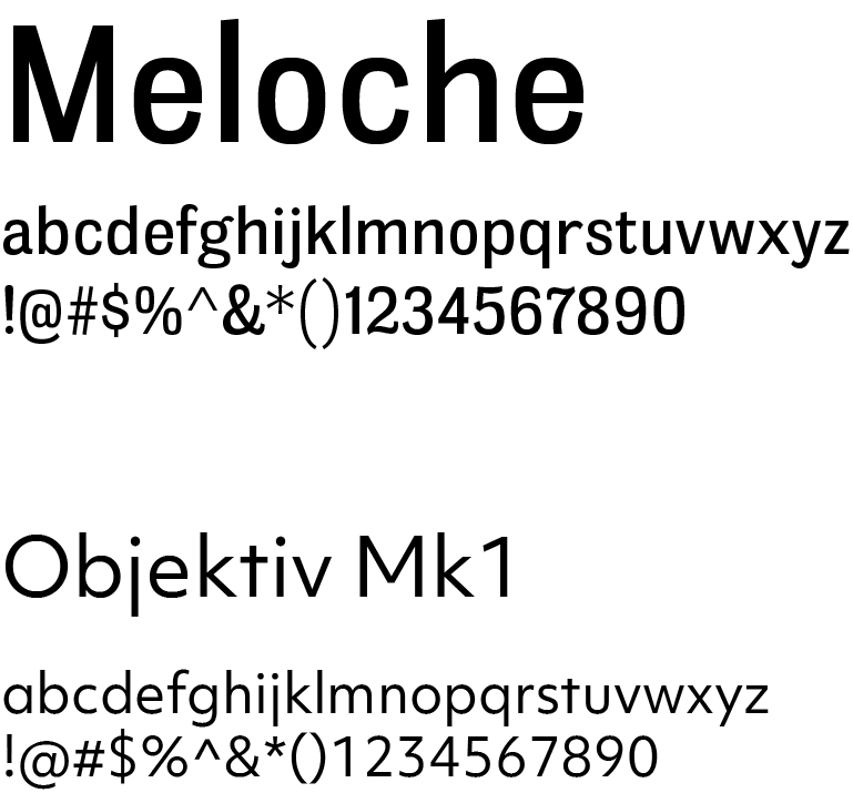
Meloche, a serif font by Jonathan Hill, includes refined serifs and balanced proportions. Objektiv 1, a modern sans-serif, adds a touch of modernism with clean lines and minimalist design.
PATTERNS
These are the geometrical patterns of VERVE. It can be used for any packaging materials, backgrounds or wallpapers, and other brand elements.
The shapes within the pattern can incorporate a variety of color combinations from the brand's palette or can be monochromatic. Moreover, they are versatile for standalone use across various design elements.
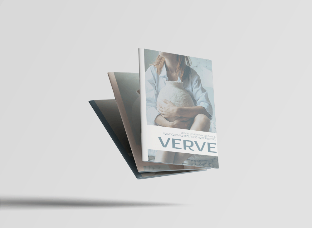
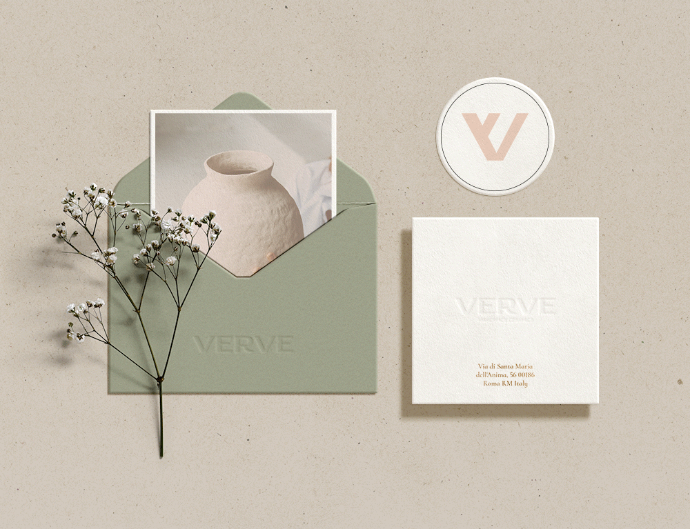
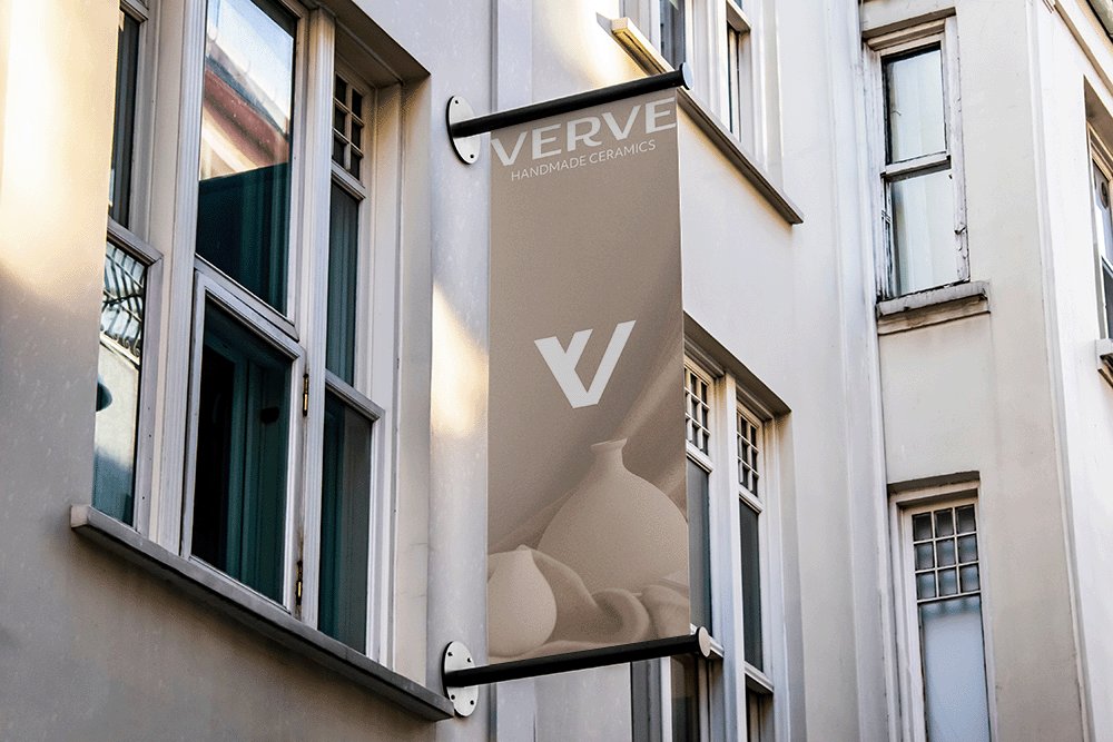
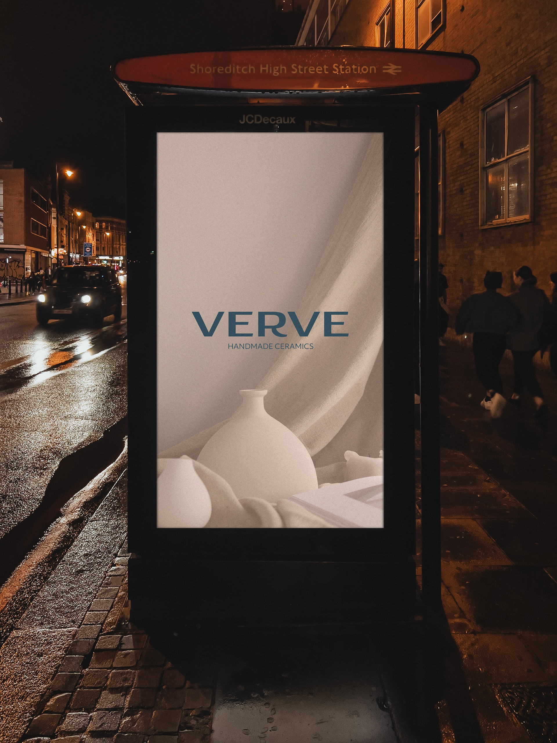
Here are some mockups of the branding to see how it would fit in a real setting.
WHAT I LEARNED
The importance of research in the design process. Studying the brand and staying updated of evolving design trends significantly refined my creation of this brand guideline.
I also learned the value of adaptability and flexibility in brand guidelines.
Lastly, is the simplicity and minimalism in effectively communicating a brand's message across different platforms and mediums is significant when creating a brand identity.
