Capstone 2024
During our capstone this year, me and my team had the opportunity to work with QUACK Dials. QUACK is an innovative parallel and power dialing platform for sales teams in the tech marketing industry. Throughout the project, I did the redesign of the Admin page and ensured the consistent maintenance of our brand identity across all deliverables.
Our client provides:
Three plans: beginner, advanced, and professional.
Complimentary cold call coaching sessions to elevate team performance.
Comprehensive reports providing metrics analyzing the volume of dials, connect rate, talk time, meetings booked, and number of conversations.
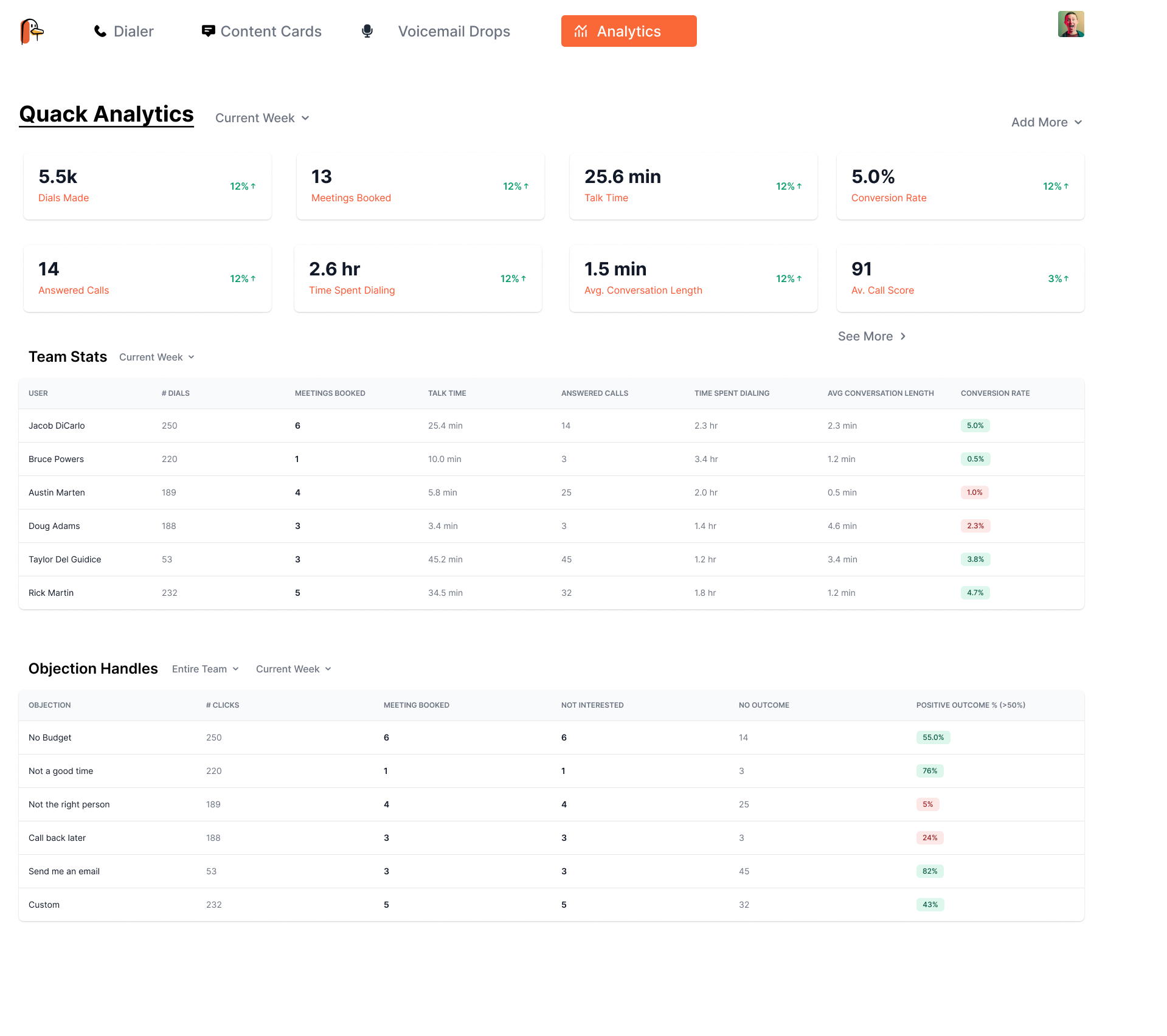
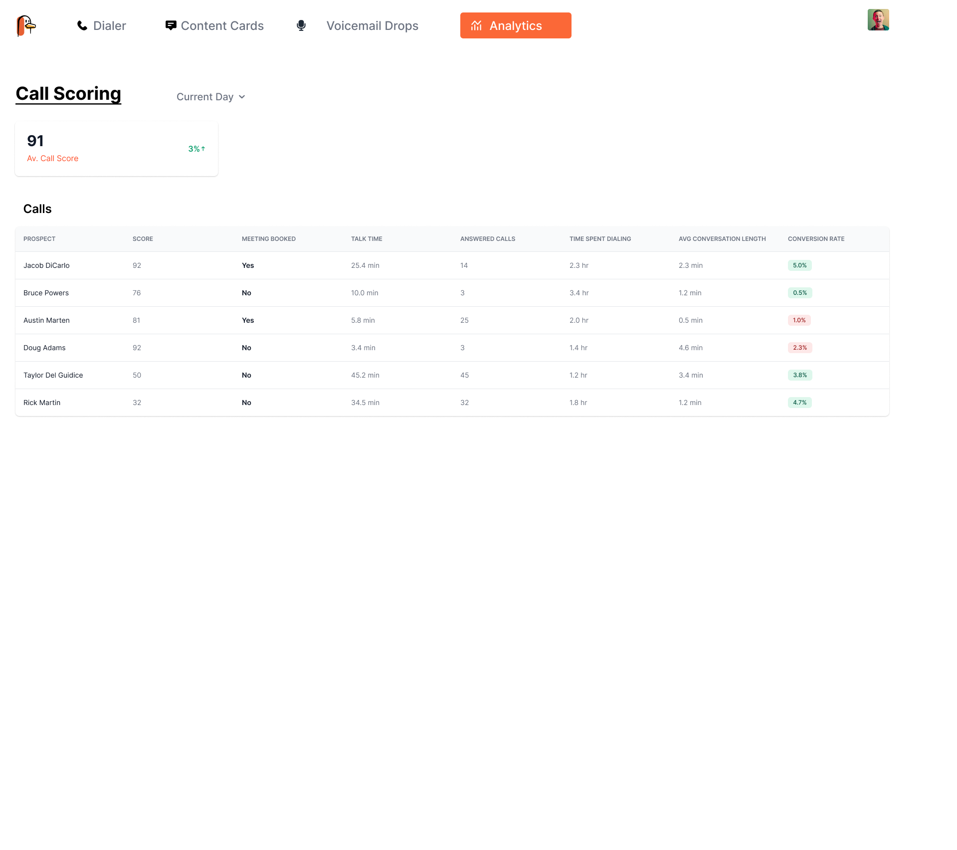
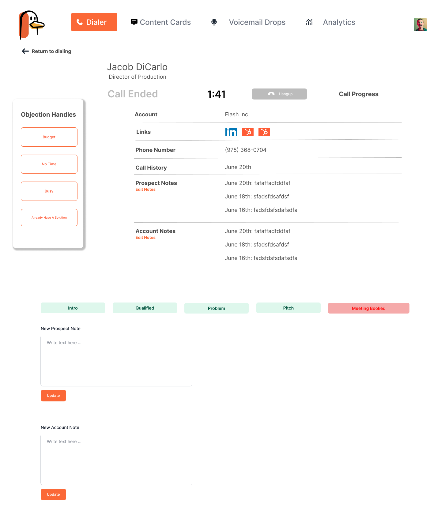
This is Quack's Admin page which consists of their analytics and the dialer panels. This page is used to show each of the admins' stats of how they are doing in QUACK. The goal for the redesign is to make it more interactive, add more visual elements in, maintaining a cohesive look that aligns with the brand, and a page that is easy to navigate through.
Although the page is organized and all content is there, the problem with the current admin page is clarity. The page is very statistical and cluttered. They've also used very small text and numbers which is very hard to see.
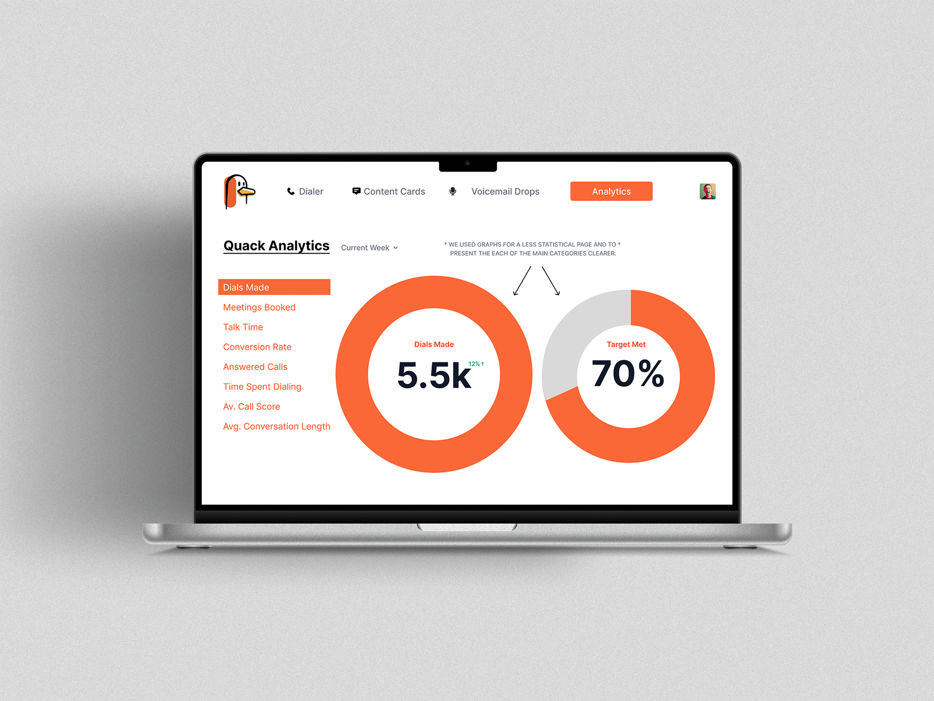
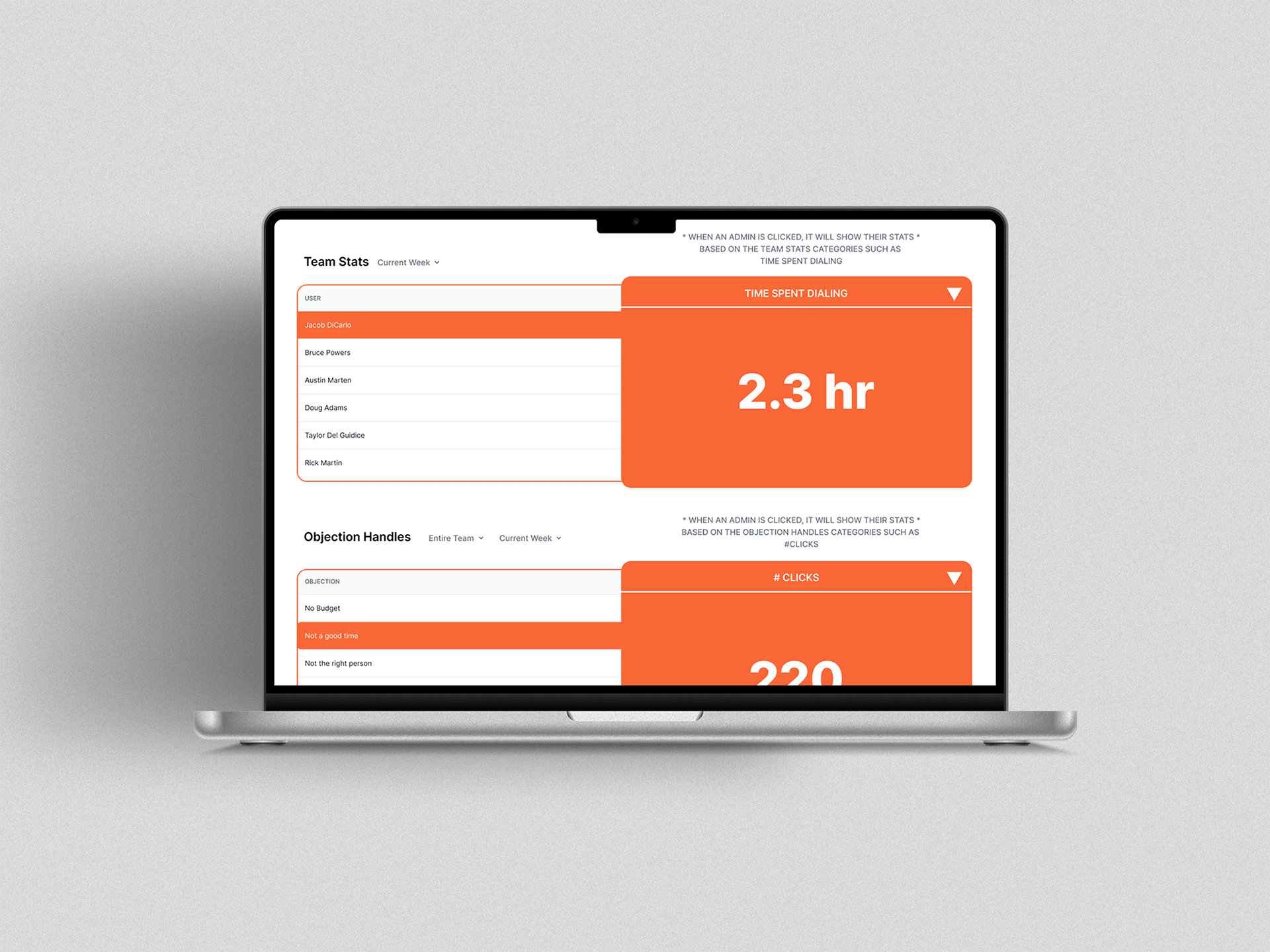
To solve this problem, we’ve used circled graphs and rounded rectangles as the visual component to show the analytics. Making sure everything is clear for the Admin, we made the main results pop out more to enhance the user experience. You’ll see this throughout the redesign of the page. We’ve also added a target met graph that allows admins to track their progress at QUACK.
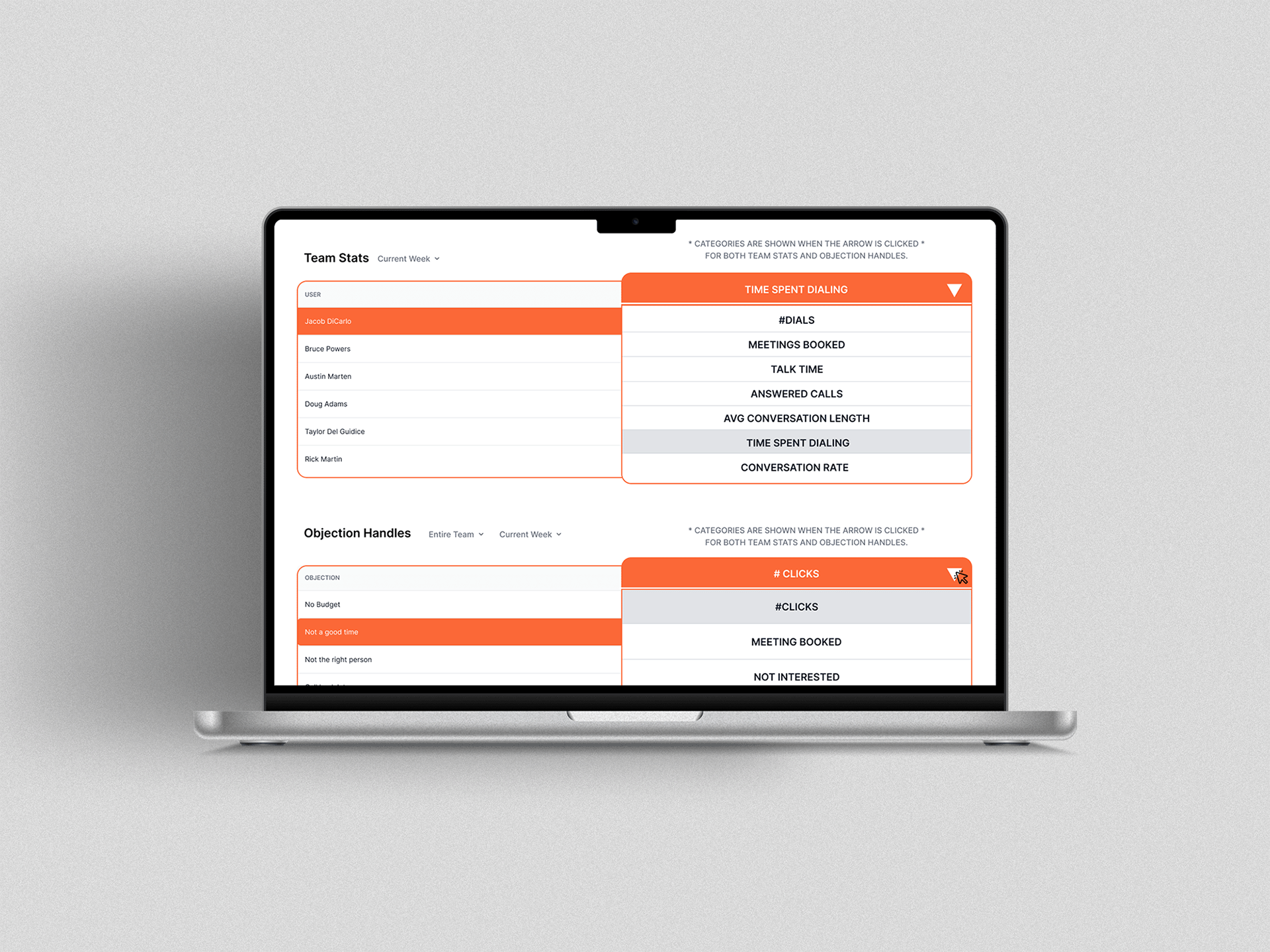
This is the redesign of the team stats and objection handles. By default it will show an improved layout of the table. Left side are shows each of the admins and the right side will show their stats. When the arrows are clicked a dropdown of the other categories will show. This makes it easier for an admin to focus on one main stat or objection handles they want to see.
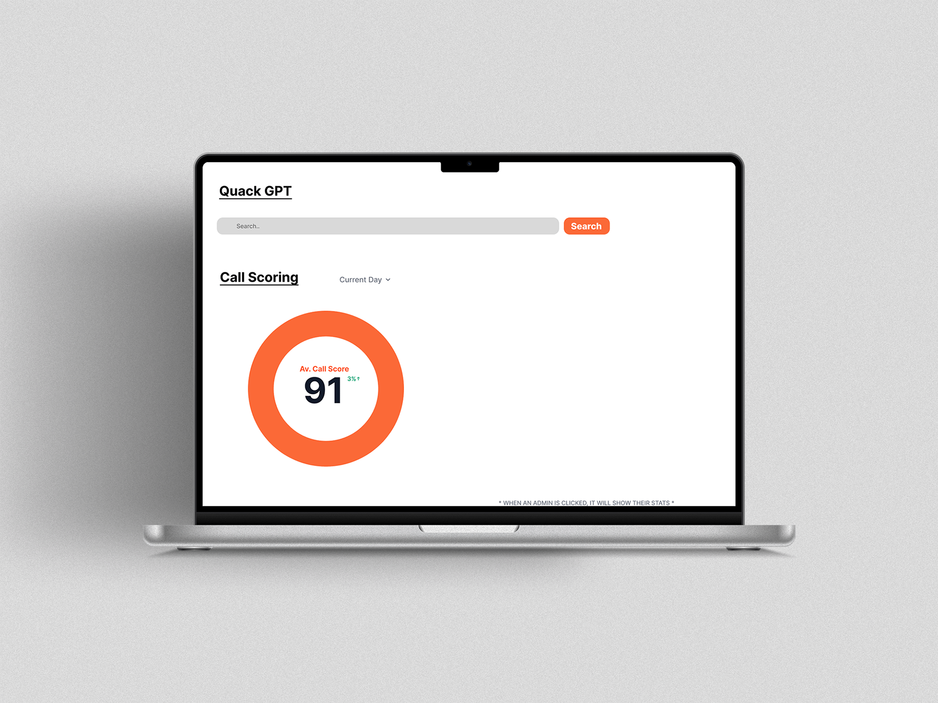
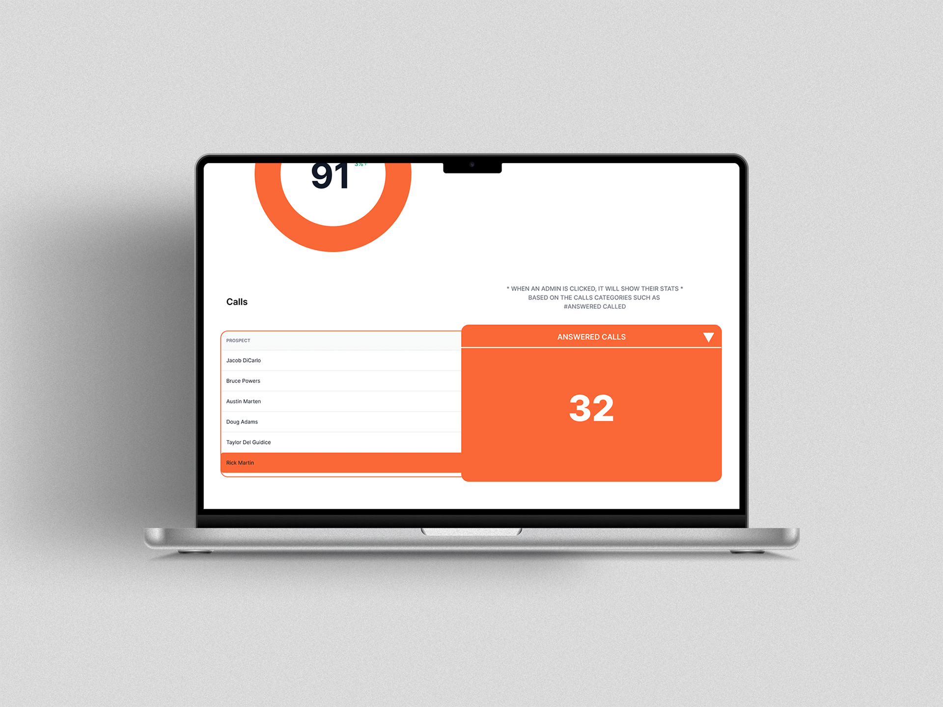
Similarly with the original design of the Call Scoring. They've used the same data table layout with small texts and numbers which makes it very hard to see and navigate through.
Once again we’ve used the same circled graphs and the new table layout to improve the overall UX and UI of the page and maintain a cohesive look throughout the page.
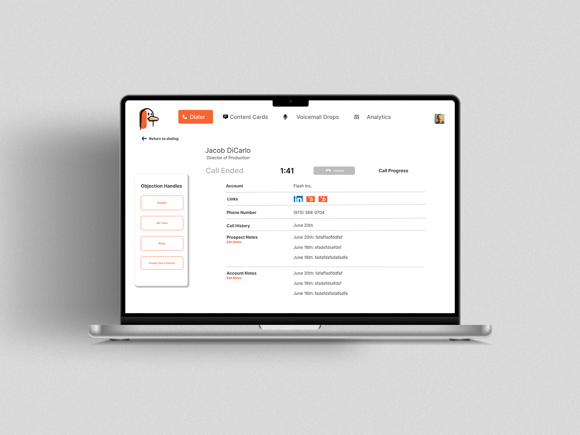
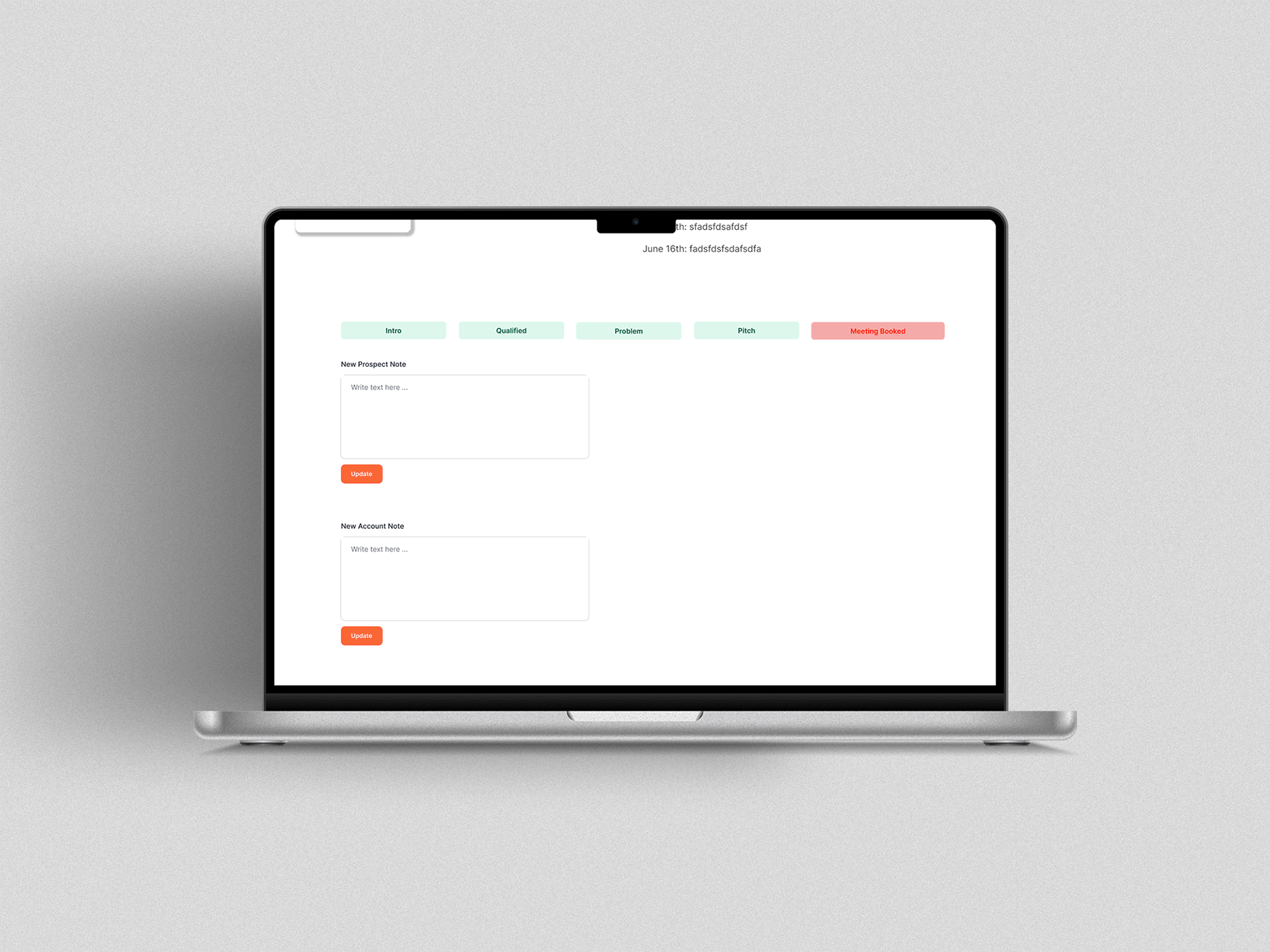
Lastly is their Dialer Section in the Admin page. From the previous layout, of this is very cluttered and all of the information is brought up to the admin in one screen.
To fix this problem, we’ve made minor changes to the design,
We’ve placed the left side, which is the important part which includes the objection handles and account info of the dialer on the top side and when scrolled down, we’ve moved the notes on the bottom side of the screen. This tidies up the clutteredness of the original design and keep it clean, minimal, and clear for the admin to navigate.
Throughout the redesign, we made sure to stick to the brand guidelines provided and used their main colors orange, black, and white for the overall re-design of the page but there are also instances where they’ve used shade of green and red in their website.
Overview of the ADMIN Redesign
